DingTalk - Yida
How to Turn an In-House Application Into a Marketable Product
DingTalk-Yida is a low-code development platform that enables the creation of enterprise applications through drag-and-drop functionality. It is seamlessly integrated into DingTalk, which holds the top market share for work collaboration software in China.
Company

Platform
Desktop & Mobile
Industries
Low Code
Timeline
March 2020 - May 2021

Yida was a developing tool incubated internally, supporting all the Alibaba Group and eco-company to build enterprise apps quickly. In 2020, Alibaba Group published the Cloud Unity business strategy. Under this goal, Yida merged with DingTalk ran on Ali Cloud. So our ambitions were to create the Chinese biggest low-code development platform that embraced a rapidly evolving business and more diverse user base.

How it works
Marketing Goals
Integrate to DingTalk and ready to go-to-market
Help enterprises to deliver digital transformation with Yida Apps
Establish a strong relationship with local partners (ISV)
My Role
Shaped the design strategy based on the group business object through the brand, customer service, user experience, and eco-system sides
Transformed the internal tool into a commercial product, embraced a rapidly evolving business and a more diverse user base
Unified the experience across different platforms, build a stable and extensible foundation to match the agile iteration
Established a good relationship with ISVs, helped to review the third-party solutions
Background
When I started working on this project, I found that the design was in very chaotic status. For a long time, there had been no designer involved, and many functions were added by developers casually. There was no consistency in that different pages looked like different products. Turning such an internal tool into a commercial product was a tough task.
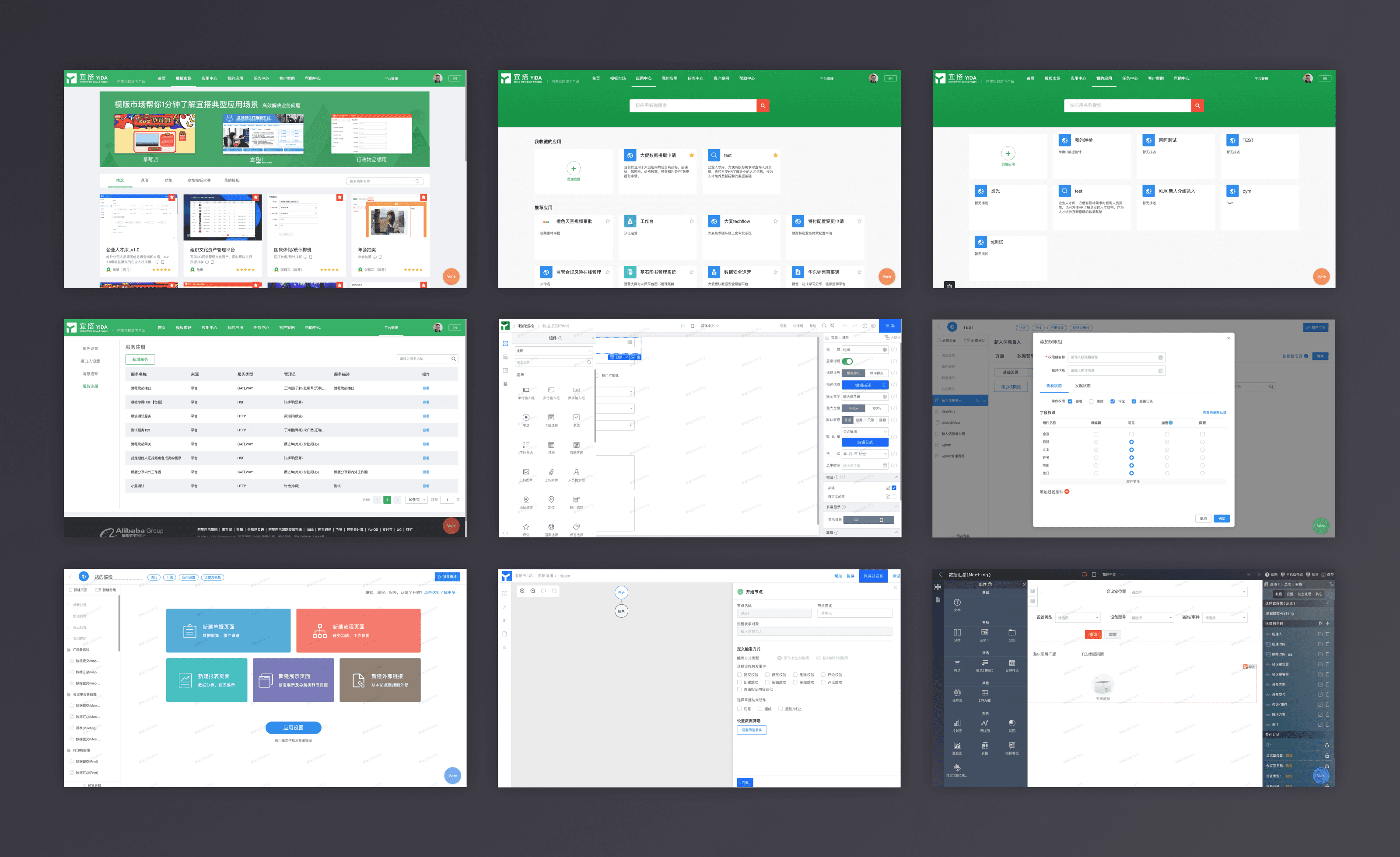
Chaotic Interface
Design Challenge
When Yida was integrated into DingTalk, the biggest problem was that there had been a huge change in product user groups and orders of magnitude, in addition to the adjustment of brand strategy and the transformation of commercial functions, the existing product architecture could not meet the needs of diverse user types and complex business scenarios.
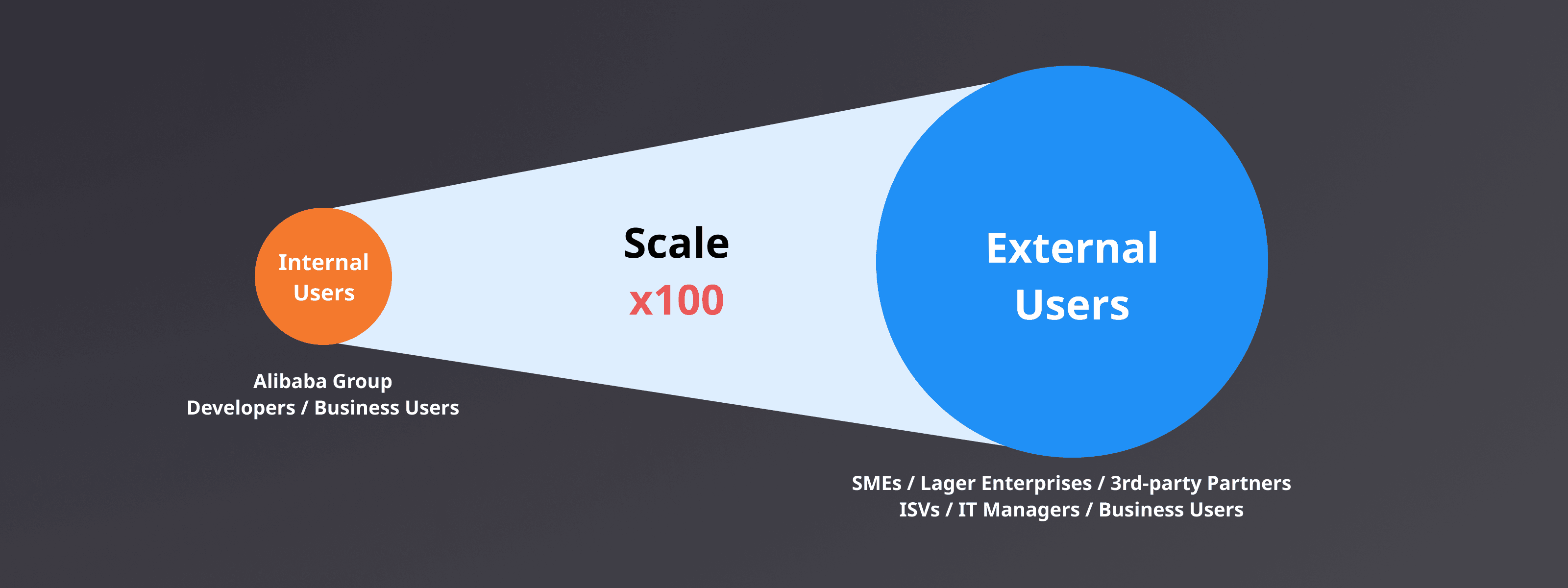
Diverse users and roles
Yida lacks the role of optimization at the overall architecture level on the product side. The product iterates mainly on adding functions, without clear orientation, direction, and strategy. As a result of the product in the functional organization confusion, the application of the construction costs and learning efforts are high, the overall user experience is not good. So, the design challenge is driving the product architecture update through design.
Knowing Users and Customers
Through DingTalk background analysis of existing customer data, combined with the input of the sales team, it is appropriate to match the proportion of users to present a pyramid-like hierarchy. Based on the previous interviews and surveys, the characteristics and goals of different types of users are summarized.
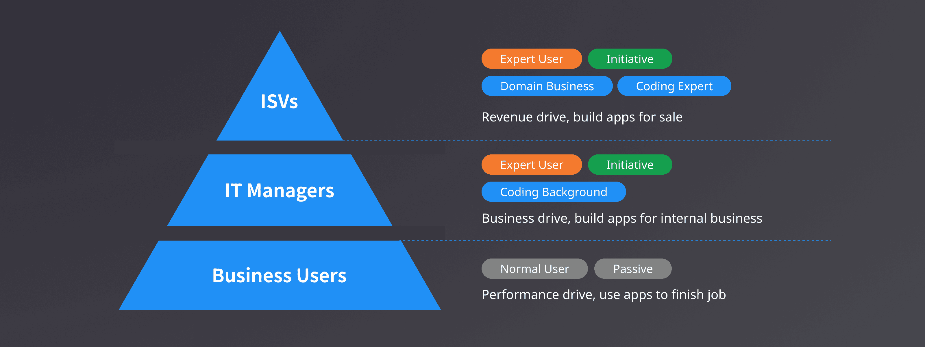
User Hierarchy
Based on operational back end data, all of Yida’s active organization related data is Quantitative analysis, the customer profile is abstracted, and the analysis results are presented to management as a dashboard

To comply with my non-disclosure agreement, I have omitted and obfuscated confidential information.
Knowing Marketing and Competitors
Based on the open data, dig the main competitors from the market side, understand their development path, product matrix, market strategy, and competitive advantage.

Marketing Study
Conduct in-depth analysis of key competitors from the product side to understand their core functional logic, product architecture, and deployment and delivery patterns.

Product Probe
Shape the Design Strategy
Through the business, product, and user three dimensions of research and analysis, determine design strategy and objectives.
Target user: ISVs and IT Managers
Target customer and size: 100-500 employees, manufacturing & IT
Design goals: For expert users, improve the efficiency of page building and application configuration. Optimizing the platform framework to reduce the difficulty of deployment and maintenance of complex applications.

Shape the Strategy
Customer Awareness
Customer awareness is about how do we touch the customers and users, I worked on the landing page and grown it into a new website including fully functioning portal with template center.
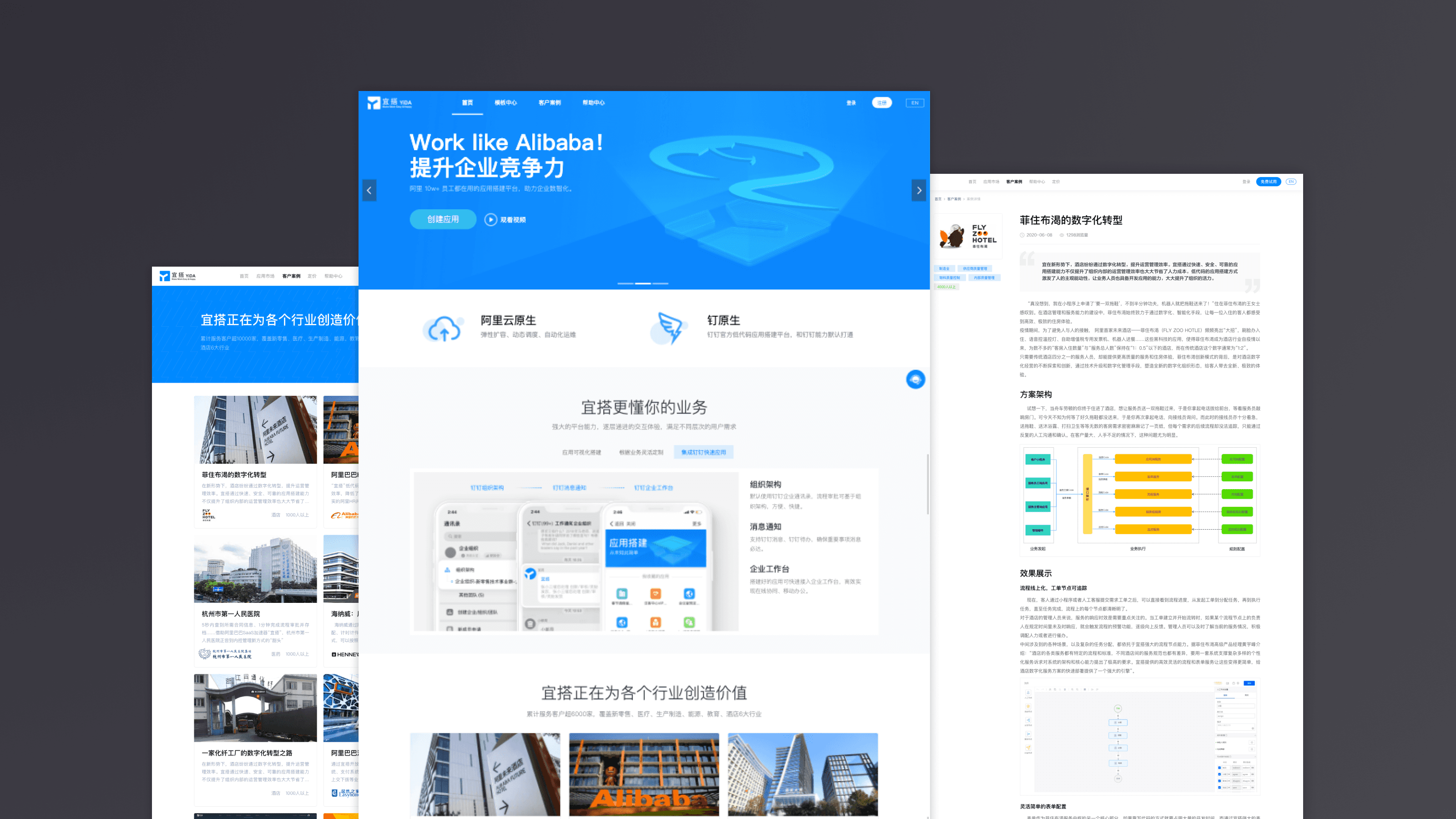
Customer Awareness - Landing Page
I have also worked on refining the new architecture when Yida was integrated into DingTalk, it unified the experience across different platforms. Web portal, DingTalk desktop client and mobile app.

Customer Awareness - Unify Experience
Customer Service
2nd part is about customer service, I have also worked on the help center and ChatBot, it allows users to access the help doc or video online. ChatBot can improve service efficiency. I also helped to write the help docs and record training videos because we were lack of technical writer roles.

Customer Service - Help Center & ChatBot
Product Experience
To improve the product experience, this part was the key. I have also worked on the core features and product architecture.

Product Experience - Refine the Architecture
Mental Model
At first, I went through the product and try to refine the mental model of building a business app. Pages were the minimum viable unit, they referred to business entities and events. Logic defined the rules that how pages and data work. In the end, the permission defined what the user can see on the interface. Base on this mental model, I had a clear route to organize the elements and improve the user experience.
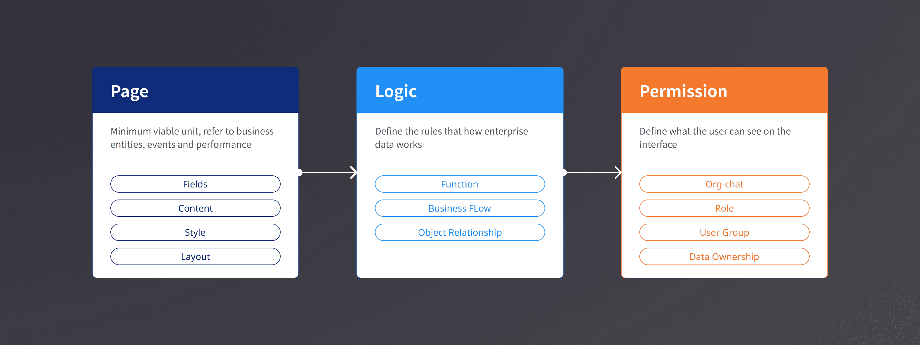
Refine Mental Model
Harmonized Experience
I addressed the design goal as harmonized design, tried to make a coherent experience across the platform. The improvements included shell and architecture, navigation, and application build experience.
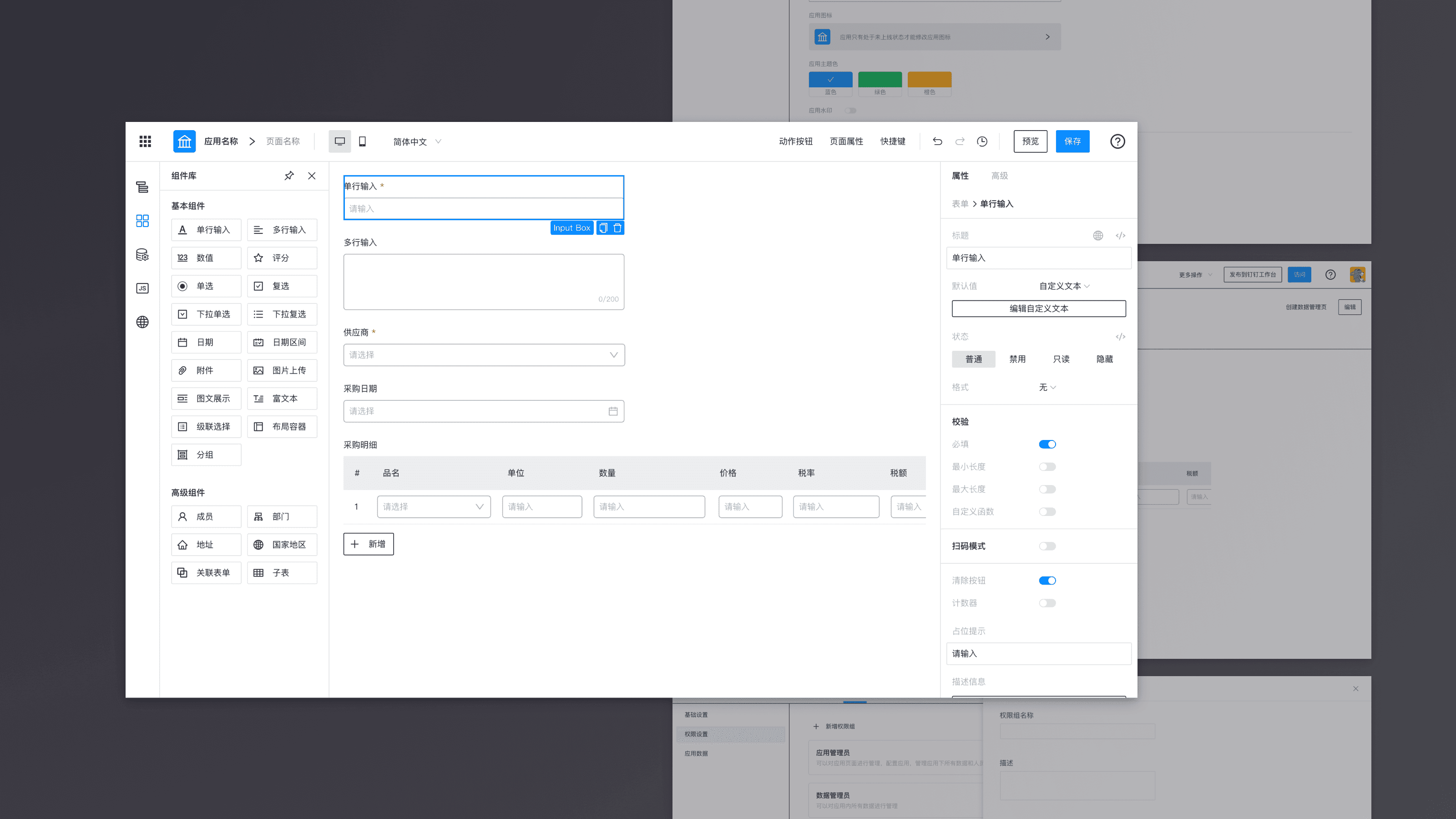
Harmonized Design - Shell & Architecture, Navigation, App Build Experience
Shell Design
The legacy shell design you can see is awful. Different sizes, styles, structures and interactions. Users would be easy to get lost in the system and the information architecture was not clear.

Legacy Shell
To improve this, I redesigned the shell bar with clear structures. Users can easily get the current system level through the shell bar style. Meanwhile, I put the navigation-related content on the left side and put action on the right side of the shell bar.

New Shell Design
The new shell shows the information architecture of the system. The application management page is the core part of the system, it centralized the logic and permission config of each app. Users can easily navigate to any 1st level page through the bento menu anywhere. User will get the designer shell when he edits one specific page, all the page designers keep the same shell such as form designer, report design, flow designer, and logic designer. Users can get a clear system level and navigate efficiently with this new shell bar.
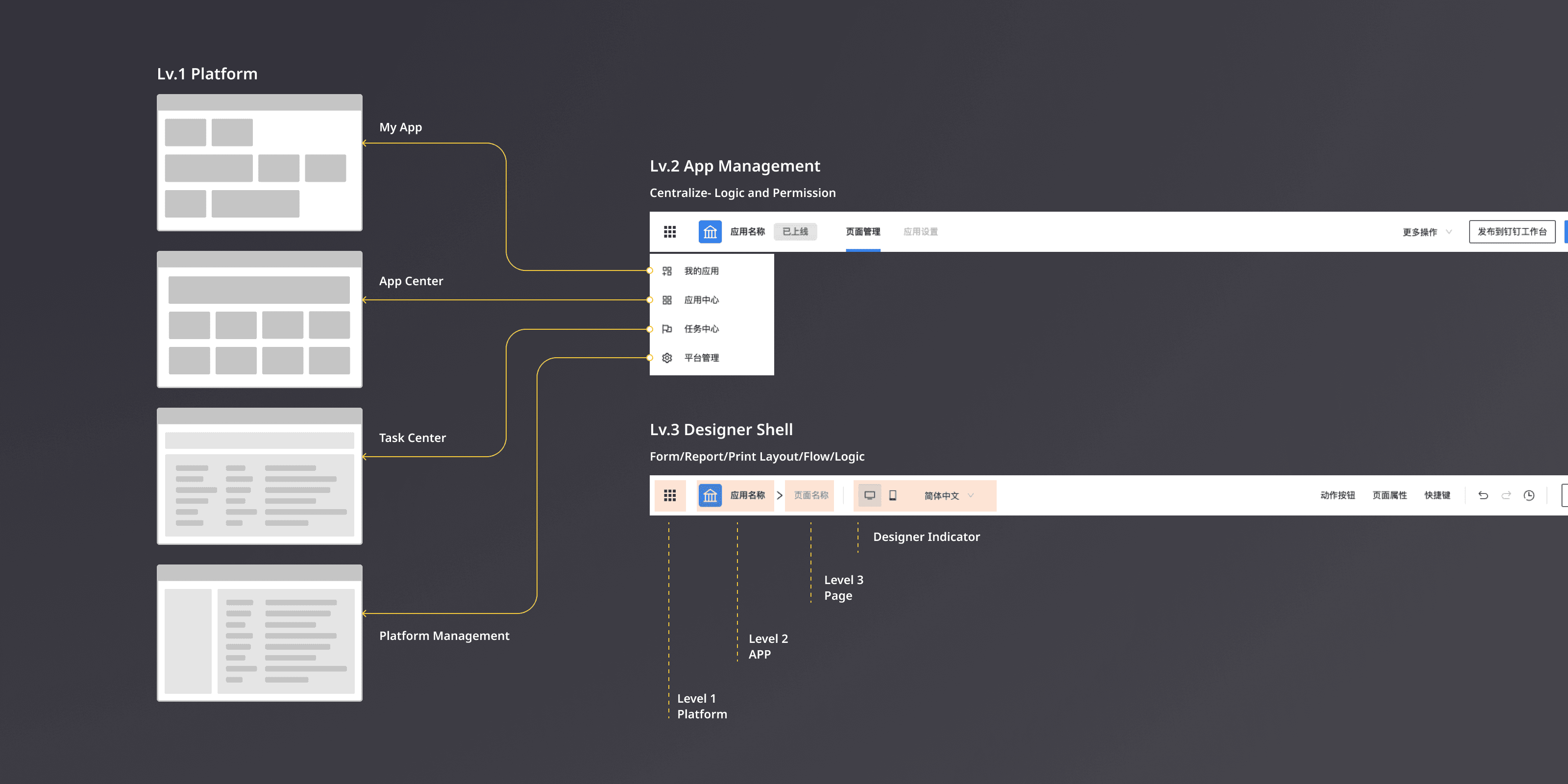
New Shell and Navigation
New Building Experience
Next part is about the form designer. It’s a ongoing improvement with lots of details. I explored this direction and we are applying this concept to 23 form components.
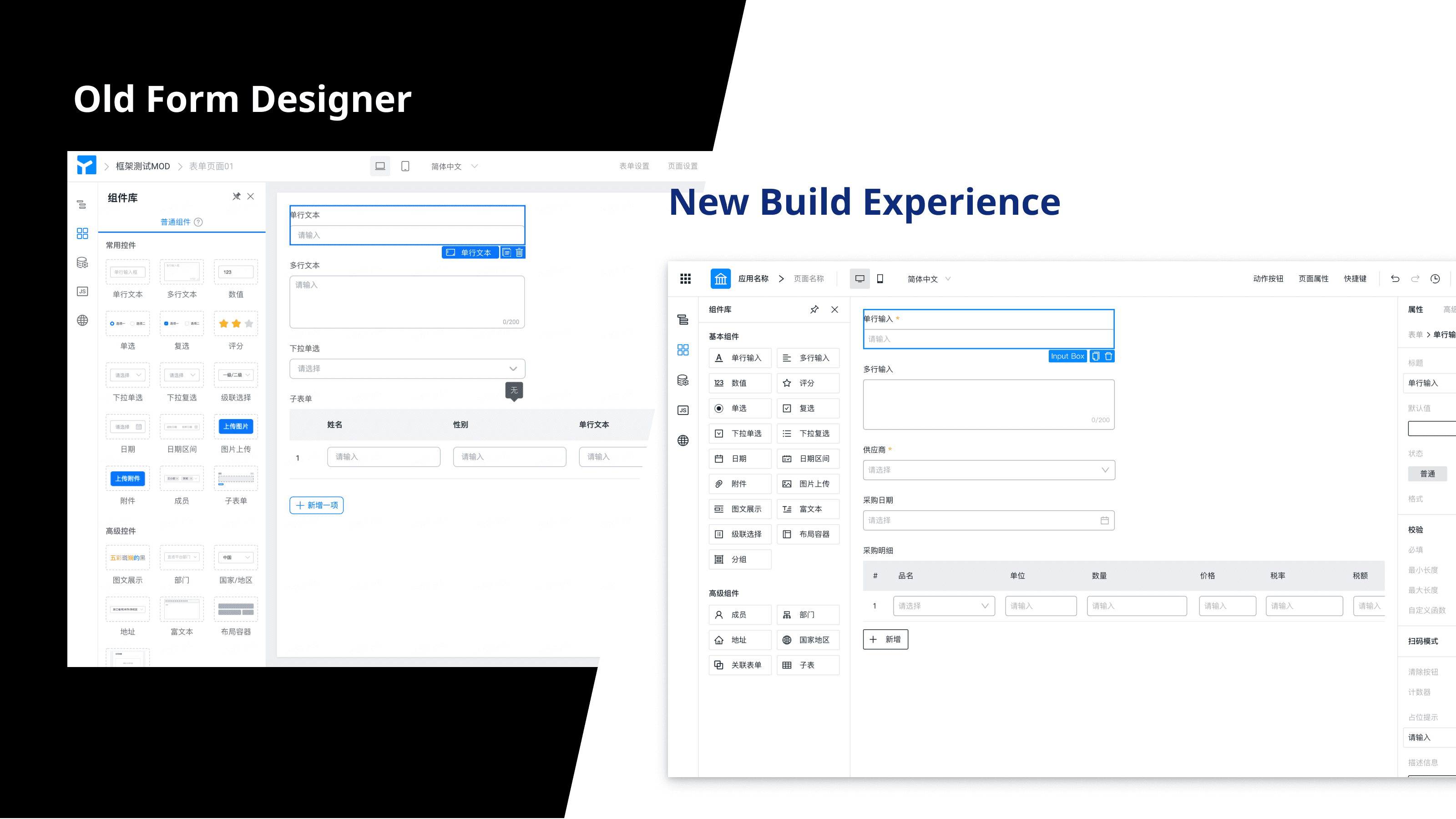
New Application Designer
The first improvement is the component panel on the left side. I grouped the form elements based on business meaning. For example, the first group is general elements such as input, select. The second group is business elements such as select employee and select department. I also made them consistent from looking and feel by using icons instead of thumbnails.
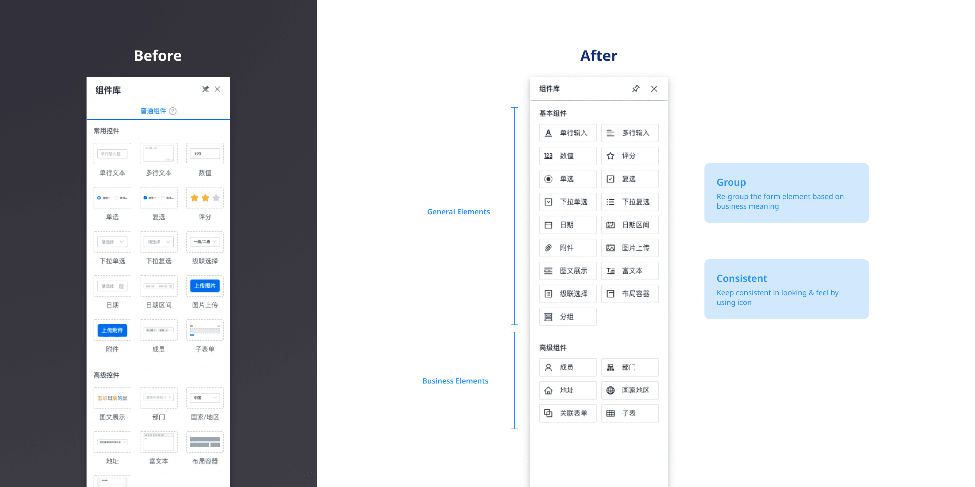
New Component Panel
The second improvement is the property panel on the right side. I redesign the structure by the system mental model. Users can follow the same model to config the property of each component. We have 23 form components in total, all the component property panels will follow the same structure. This will reduce the learning effort for users.

New Property Panel
Besides, the new design is more friendly for notebook users because of the compact UI, the canvas in the middle is increased by 15%. I also unified all the terminology across the system which always confused new users a lot.
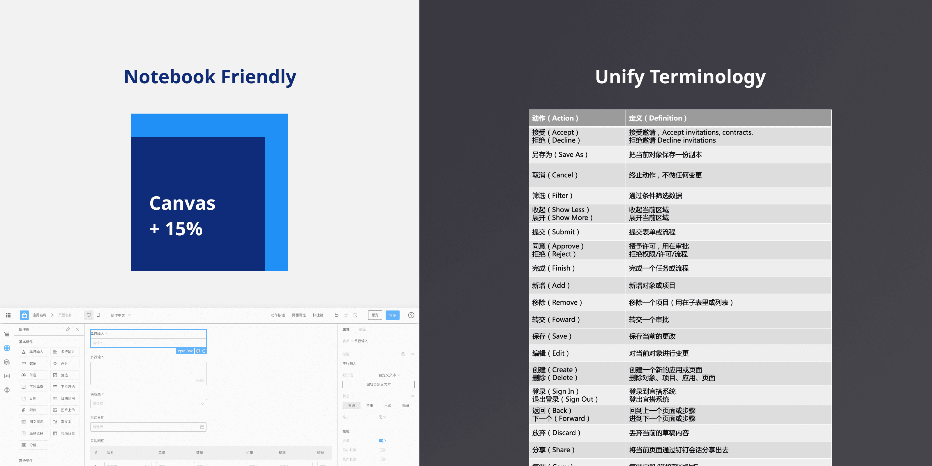
Other Improvements
In addition, our roadmap had a goal of passing the magic quadrant estimation of Gartner. So it means the design must have good readability under English. The new design does this better than the legacy design.

Prepare for estimation by Gartner Magic Quadrant 2022
Design Principle & Best Practice
As a whole, I made this design principle for the project in the next stage. Coherent means the entire system follows the same mental model both on interaction and business logic, make the user enjoy the same intuitive and consistent experience across the system. Extensibility means, the design is not only aiming for current needs but also supports future extensibility, the design should start with a flexible structure that can meet the iteration in long term. Efficiency means, streamline and optimize workflows, help users work better and faster.
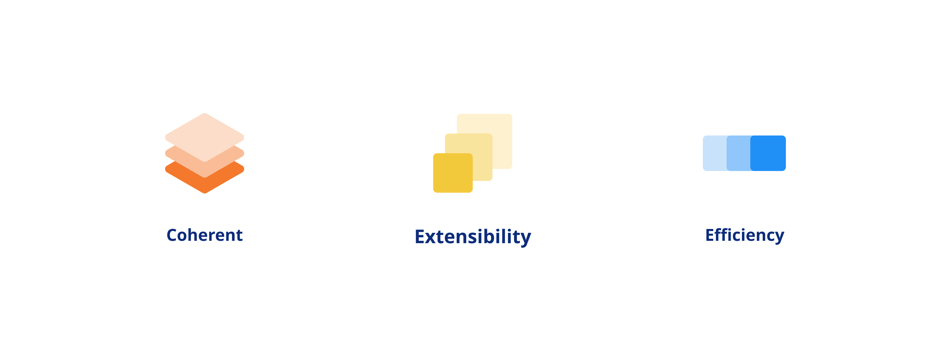
Design Principle